Summary
eduViz is a visualization project that aims to make sense of the recently-released College Scorecard Data. The dataset, provided by the Department of Education, contains information on higher-education institutions. This project began with the intent of indicating predatory lending practices in universities, but eventuated as a more expansive and high-level overview of the higher education market.
Some of the metrics provided are admission rates, student completion rates, debt and repayment, earnings, demographics and more. The dataset contains nearly twenty years of data, with about 1700 variables tracked. Most of this visualization will focus on data from 2013.
Project Scope
Last semester, I visited ProPublica in New York to meet with some of their reporters. In the process, I became more acquainted with the dataset and some of the stories that could emerge from a compelling visualization. The primary goal of this project is to visualize a non-trivial and massive dataset, with the hopes of extracting meaningful findings and providing other data scientists with a useful reference for the dataset.
With such an expansive base of variables, much of the project focuses on statistical analysis. Determining which variables are greatest importance, and which are most apt for drawing conclusions proved to be a difficult and arduous process.
Objectives
The main goal of this visualization story is to serve as a tool that:
- Gives an overview of higher education in America
- Reveal insightful trends and patterns
- Allows students, parents, and professors to compare and contrast which schools are more affordable and accessible
- Provide aspiring data scientists with resources and methods for their own analyses
To convey a successful idea of this visualization, the website strives to be:
- Intuitive - Needs little explanation, guides the user's experience naturally
- Accessible - Understandable to data-literate readers of different levels
- Usable – Able to be navigated and operated without error or frustration
- Compelling - Providing sobering conclusions from thorough analysis
Audience
The main goal is to take an immense and somewhat cryptic dataset and transform it into a visualization, or series of visualizations that is sensible and more readily available to the general public. This project's primary audience is data-literate readers. The data caters mostly to statisticians and researchers and other data scientists.
My original audience was the reporting staff at ProPublica, in particular Annie Waldman and Scott Klein.
Some others who will likely take interest are:
- Potential education stakeholders – Students seeking to further education, as well as professors and others affected by performance of universities
- Members of education-driven entities such as Kaplan, CollegeBoard, and ACT
- Persons of power in universities – Those who direct financial resources or influence the school’s approach in providing affordable education
- General Public – This app will exist firstly as a story-telling mechanism, with the primary purpose to inform
Marketplace and Barriers
- Propaganda and advertising of for-profit institutions has the ability to obscure the story’s message.
- Skepticism of readers – this can be mitigated with the availability of source data and a comprehensive description of methodology.
- Lack of comprehension – If the visualization is too robust, complicated, or requires special knowledge; it will limit the number of people who understand it. The project aims to be highly intuitive and accessible.
Design
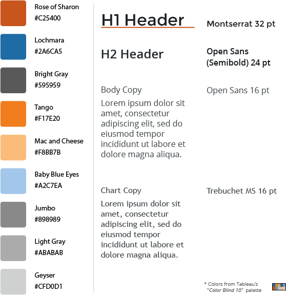
In constructing a web-based visualization, it is often useful to have a style guide. Although creating a style guide can be time-intensive, it ultimately saves a great deal of time deliberating over small details such as fonts, colors, alignment and overall aesthetics. Some of the design goals are:
- Intuitive and usable interface – The tool should be easy to use for almost everyone
- Aesthetic and minimal – Visual design will be practical, simple, and aesthetic elements will serve a functional purpose (e.g., color of data points as a representation of ordinal category)
- User’s experience with the site should be unobtrusive, satisfying and memorable. One’s reading and interaction with the app will make for a lasting impression
Color-blind accessibility and readability are critical for visualizations featuring color as a functional dimension. The use of style and aesthetics in visualizations is not only for visual appeal; it serves the function of making information more accessible and digestible to readers. My colors are derived from Tableau's Color Blind 10 palette.
The main fonts, Open Sans and Montserrat are freely available from Google Fonts.

Deliverable
The product comes with three main parts:
- Data processing - My iPython Notebook, featuring detailed process of preparing the data for analysis.
- Data analysis - eduViz.io
- Github repository with code - https://github.com/cyniclone/edu-viz
User Stories
User stories are a useful way to determine the ways in which the project will be used and the needs of users. Examining use-case scenarios allows one to better provide for varying audience members and enhance usability.
As a potential college student, or person seeking higher education...
- I want to – compare and contrast different colleges, looking at affordability, and outcomes; learn important terms regarding financial aid.
- So I can – select an affordable school that garners positive career prospects.
As a professor, or individual working in higher education,
- I want to – see how my school compares to others in terms of debt and career outcomes.
- So I can – take active involvement in my school for matters that regard financial aid.
As a data scientist...
- I want to – see the author's methodology and approach to the dataset.
- So I can – conduct my own analyses and further contribute.
Appendix
Other useful documents produced in the making of this project:
- Gantt Chart
- Thoughts on different project management methodologies
- Work Breakdown Structure
- Illustrator File of the style guide and logo design.
